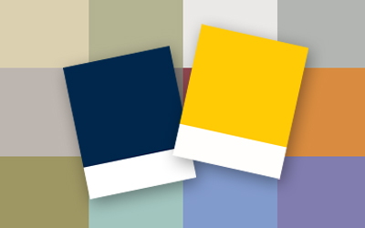
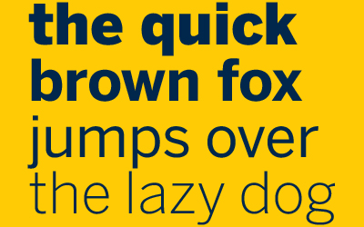
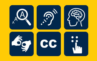
Section Title
Brand Standards
Style Guide: Typography
Fonts: the art of words
Typography is a powerful tool. When used effectively, the right font commands attention, elicits emotions, and above all, creates a voice. It’s why typography is such an essential component of our brand’s visual identity.
Recommended fonts
Licensed serif fonts for print
-
Concorde
-
Garamond
-
Minion
-
Weiss
-
Electra
-
Dispatch
-
Caecilia
Licensed sans serif fonts for print
-
Avenir
-
Benton Sans
-
DIN
-
Meta
Free serif fonts for print or web
-
Georgia
-
Times New Roman
Free sans serif font for print or web
-
Arial
-
Lucida Grande
Free web-specific fonts
-
Verdana
-
Tahoma
How to choose a typeface
Legibility
Legibility refers to the design of the typeface — the width of the strokes, whether or not it has serifs, the presence of novel type design elements, etc. It is easy to tell one letterform from another in a legible typeface.
- Choose typefaces with conventional letterforms
- Choose typefaces with generous spacing
- Choose typefaces with a tall x-height
Readability
How your typeface is set, combined with the basic legibility of the typeface, yields a certain level of readability. In most cases, communication comes before style — form follows function — so resolve readability first.
- Choose typefaces that were designed for your purpose
- Align text to “right ragged” for comfortable word spacing online to avoid “rivers”
- Make sure the leading (the amount of space between lines of text) is greater than the point size of your typeface
Suitability
Consider the design intent of the typeface. If a typeface was designed for signage, it probably isn’t going to work well set as the body copy of a book. For example, Bodoni Poster may work for certain headlines, but it was not designed to be used in paragraph form.
A few technical considerations
If your design is going to include a lot of numbers or ligatures, be sure to choose a typeface that has those things. It’s best to choose a typeface that is as complete as possible. Free fonts often don’t include these critical “extras.”
Avoid trite correlations
- Don’t use Papyrus just because your topic is “ancient” in some way (Better yet, don’t use Papyrus at all)
- Don’t use Comic Sans just because your topic is humorous (Better yet, don’t use Comic Sans at all)
- Don’t use Lithos just because your topic is about Greek restaurants
- Don’t use Futura just because your topic deals with “the future”